In the end of January, LinkedIn introduced a desktop user interface redesign. It is expected to be fully rolled out to users in the following weeks.
If you frequently use LinkedIn mobile app, you will probably find the new desktop version easier to navigate, as, according to LinkedIn, the biggest reason for the new design is to provide a more consistent browsing experience across mobile and desktop. The icons are now similar in both mobile and desktop version, and the names of certain features are now aligned with the mobile app. Some new features are more streamlined, e.g., less drop-down menus, which make the user experience more intuitive.
Let’s look at a few of the more prominent changes that affect your personal LinkedIn profile.
The homepage
The elements of the homepage top menu are pretty much the same as with the old LinkedIn, however the names and icons have changed to give a cleaner look. Your profile can now for instance be accessed in the “Me” section.

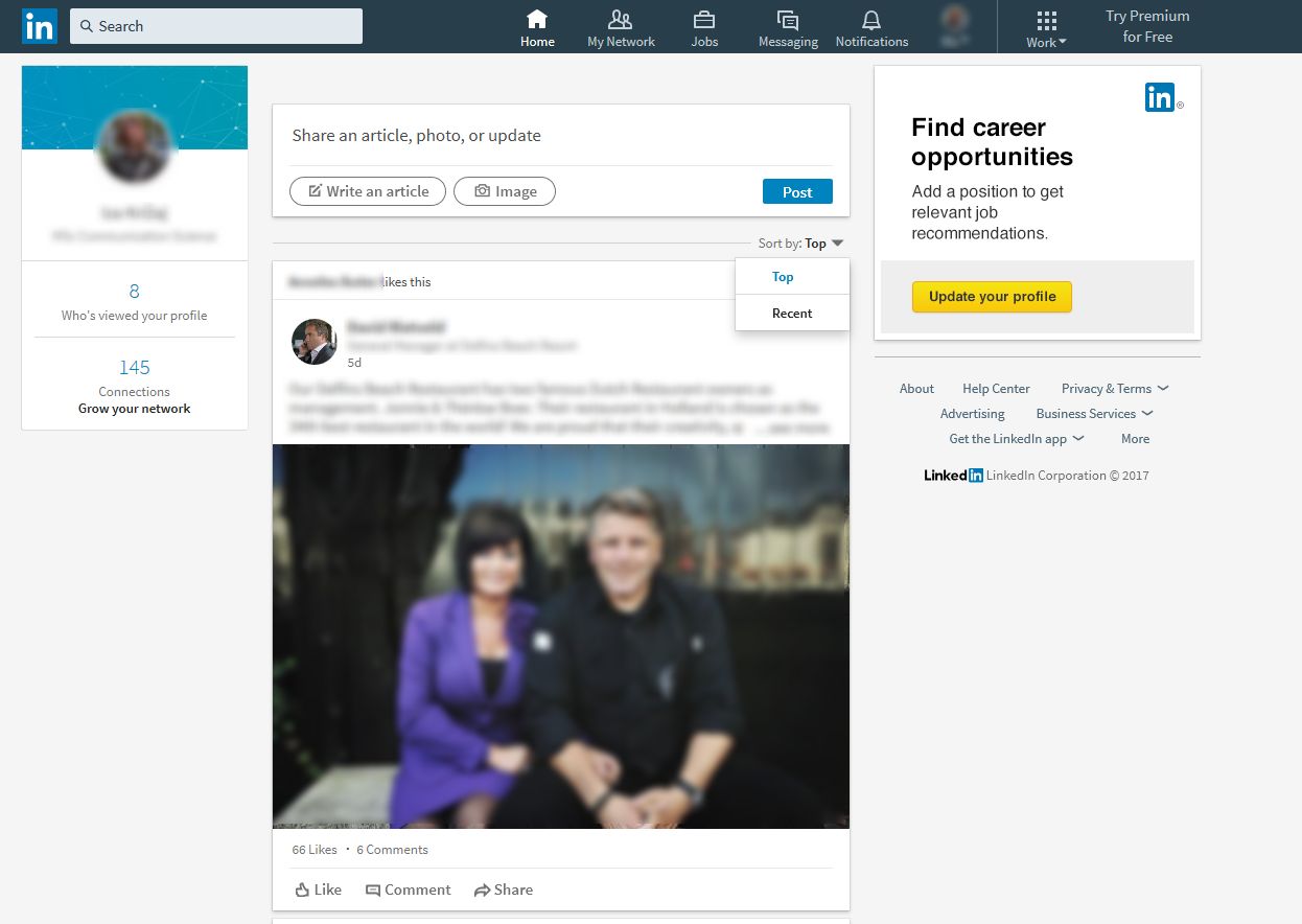
On the left side, there is now a box with a summary of your profile with statistics on how many people viewed your profile and how many connections you have (or, alternatively, how many peopled viewed your post if you published one recently).
The central position of the homepage belongs to the content sharing option. Above the newsfeed, which you can sort by “top” or “recent”, there is the button to post and share your own content. As we already learned, it is important to publish useful and meaningful work related content in order to establish yourself as a thought leader and grow your network further.
This is how the content sharing option looked like in the previous LinkedIn version:

How it looks like now:

What was previously known as “post” is now called an “article”. When you click on the button, it will take you to the publishing tool, where you can write and edit your post. Your connections won’t be automatically notified about your post anymore, but you are still able to mention people in your posts by using “@” symbol. After you post your article, it will show up in the newsfeed, and you will be able to track who has liked or commented it.
Notifications
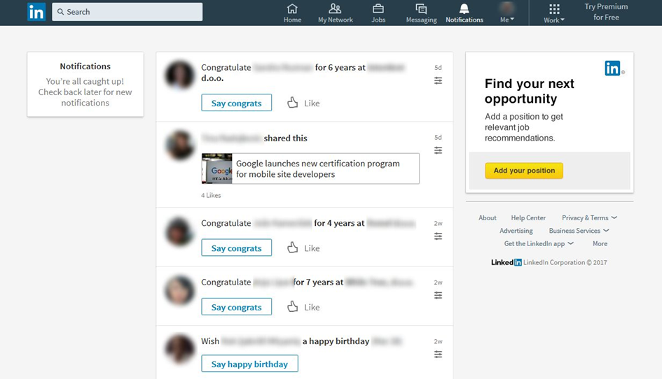
As you can see, there is now an entire page dedicated to notifications. You can access it by clicking the bell icon in the top menu. This is a great feature for increasing engagement, as all interactions are now made easier and you are less likely to miss something.

Your profile
The profile page went through some beauty makeovers – profile photo is now smaller and a circle, background image has new dimensions (1536 x 768 pixels), and the headline got a more prominent space. Headlines are searchable, so it is recommended to carefully craft those 120 characters according to what you wish to present about yourself, rather than keeping just the default job title.
An important change to your profile is that the summary is now hidden – only the first two lines are visible unless you expand it by clicking “see more”. This means that you should write a concise, compelling and engaging introduction of the summary to motivate people to click and read more about you.
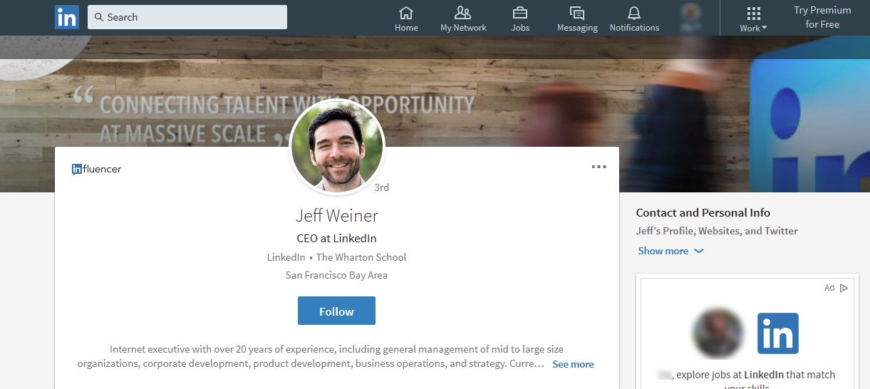
This is how it looks when someone clicks on your profile:

When someone views a profile, there is a new element underneath the summary, called “highlights”. It contains information on what you and the other person have in common, such as common connections, work history or membership in groups. If a person has a lot of posting activity, you will alternatively see there a list of his/her “articles & activity”.
Network
The changes in the way LinkedIn users can now interact with their network are a little less than great. The new network section only has “invitations” and “people you may know”, what is gone is the Alumni search. To get to your Alumni you must now do a search on schools in the search bar and find them from there. Furthermore, as there are no more tagging options it is harder to sort your connections (you could previously tag them by level of acquaintance, relevance, profession, etc.).

Note that the search option also went through so not-so-neat changes – you can no longer search by keyword, last/first name, and title. However, you can still filter searches by level of connections, general location, companies, industries, language, and schools.
Groups
We’ve written in the past about how groups help you network, join discussions, and learn knowledge about your industry. The new LinkedIn interface brings changes to the group section as well.
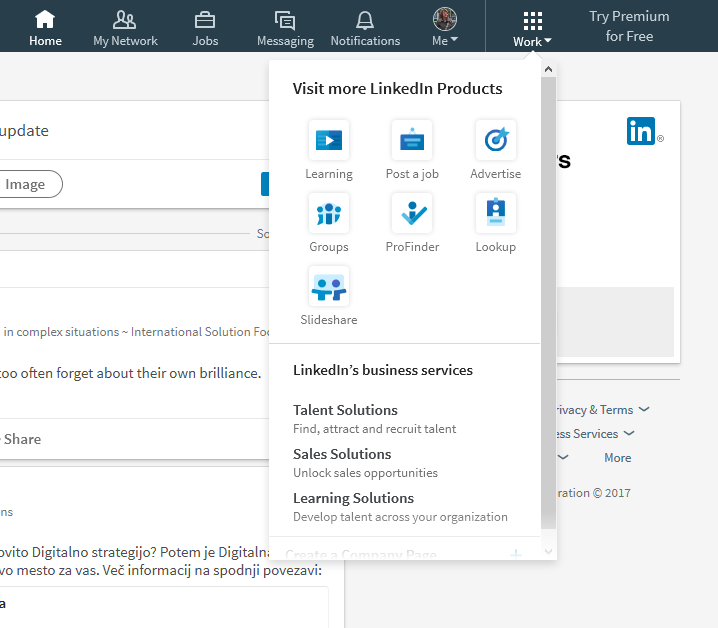
Groups can now be found under the “work” icon in the top menu.

When you click on “groups” link, you get to three sections:
- Today’s highlights (a selection of conversations from your groups)
- My groups (from here you can access all groups you are a member of, and create your own)
- Discover (new group recommendations based on your profile).
As with any change, there are some good and some bad sides, however we feel that the fresh LinkedIn look is cleaner, more intuitive and makes it easier to switch between desktop and mobile. Also, not everything is yet set in stone, we can expect to see more changes in the following months. But once you get to know about how to use the many features to your advantage, you can truly make the best of your experience, so make sure to keep reading our tips!
